Digital Accessibility: MS Word Color Contrast (6)
Make sure color is not your only method of conveying important information. In other words, do not use color alone to:
- convey meaning,
- make a distinction,
- make a comparison, or
- set something off or apart from the rest of the page.
In the image above, the red field AND alert icon indicate an error to most people. To someone who has trouble distinguishing red on-screen, they can see the error because of the icon indicators in each field.
If you categorize something by color alone, those who are color blind or blind will not benefit from the color distinction.
Color Contrast
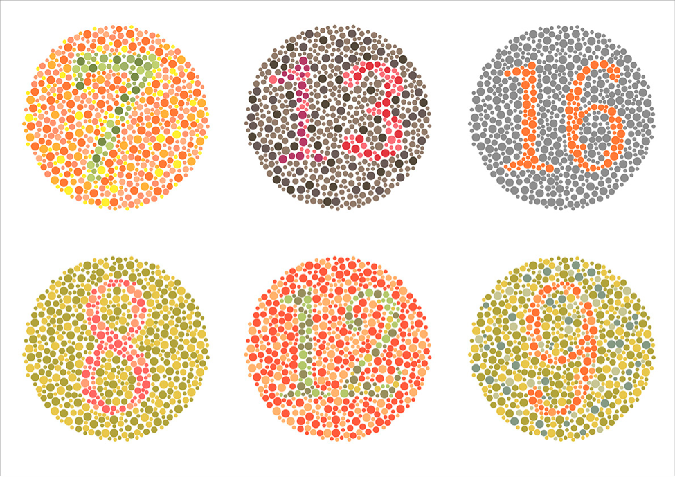
 Studies have shown that around 8% of men and 0.5% of women have color vision deficiency (CVD or color blindness). There are some colors which are not easily seen for individuals who have color blindness. Forms of color blindness include
- Protanopia (red),
- Deuteranopia (green),
- Tritanopia (blue), and
- Monochromacy (no color). These individuals need sufficient color contrast to determine imagery.
High Contrast is best. The highest contrast and most easily visible for learners with or without color blindness is Black text on a white background. WebAIM has an online color checking tool. This web accessibility checker will detect a majority of common errors in the design of a webpage. It includes a robust color-contrast checker as well. It's available as a browser plugin for Firefox and Chrome.
If you add color to embellish your materials, be sure to check the color contrast before sharing with your learners.
Learn More: Check out the color blindness slide show simulation on Google Slides to consider how color blindness affects people.


